
Have you ever wondered how color affects art? How do colors affect our emotions? Color is a very powerful tool in our world, and that applies to art as well. In this article, we will discuss the power of color in art, how it affects the viewer and how to choose the right colors for your work.
The use of color in photography
Photography is an art form that has long been used to capture memorable moments. Color is a key part of photography, as it can change the tone and mood of an image. The use of color can highlight the main elements of an image, such as the tones of a landscape or the brightness of a person. Color can highlight details that would otherwise go unnoticed.
A good photographer knows how to use color to create a more interesting image. Using contrasting colors can make images more dramatic and striking, while softer, pastel colors can create a sense of calm and tranquility. The use of monochromatic tones can create a cleaner and clearer image.
Photography should be a form of expression, not just a way to capture a moment. Color can help tell a story, express an emotion or provide an underlying message. Using the right color can help photographers create deep and meaningful images.
The use of color in abstract paintings
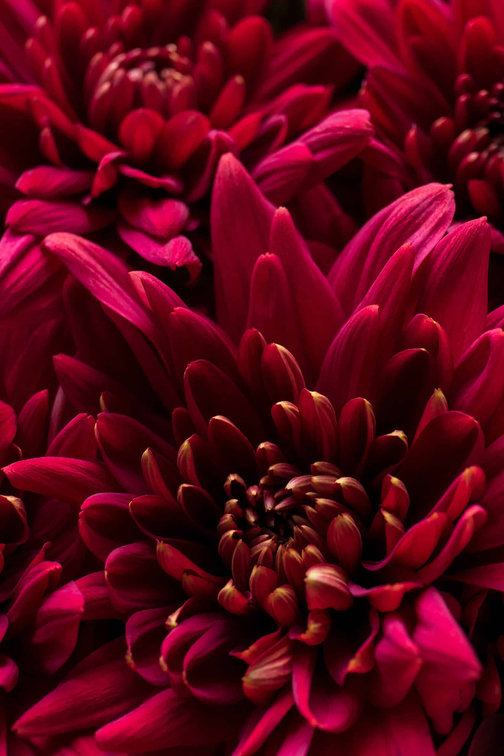
Abstract paintings are an art form that has long been used to express feelings and emotions. Color is an integral part of this art form, and artists can use color to convey their feelings to viewers.
Abstract artists use color to create patterns and shapes, which can have symbolic meanings. Vibrant, bright colors can be used to create a sense of energy and vitality, while softer, pastel colors can convey a sense of calm and tranquility.
Artists can also use color to change the mood of a painting. Warm colors can be used to create a feeling of excitement and joy, while cool colors can create a feeling of sadness or melancholy.
Artists can also use color to create a unique visual effect. For example, some artists use the opposite colors in the rainbow to create a contrasting effect, which highlights the main elements of an artwork.
Color in graphic design
Graphic design is an art form used to communicate a message to an audience. The use of color is an important part of graphic design, as it can help to emphasize the message.
Graphic designers can use color to create a sense of vibrancy and energy in designs. The use of vibrant, bright colors can catch the viewers’ attention and help convey the message clearly.
Designers can also use color to highlight specific elements of a design. For example, a designer can use a different color to highlight an action button, making it easy for viewers to find.
In addition, graphic designers can use color to create a sense of balance and harmony. Using complementary colors or colors that are in the same tone can help create a cohesive image.

Color in interior design
Interior design is an art form used to decorate and enhance interior spaces. Color is a key element of interior design, as it can help create a warm and welcoming atmosphere.
Interior designers use color to highlight the main elements of a space. The use of vibrant, bright colors can help highlight an object or create a sense of energy. Designers can also use softer colors and pastels to create a sense of calm and tranquility.
Designers can also use color to create a sense of balance and harmony. Using complementary colors or colors that are in the same tone can help create a cohesive image. Designers can also use monochromatic colors to create a sense of class and elegance.
Designers can use color to enhance the way a space is perceived. The use of warm colors can help create a sense of warmth and coziness, while cool colors can help create a sense of calm and relaxation.
The theory of color and its importance in art
Color theory is a way of understanding how colors relate to each other and how they affect the viewer. Colors can have different meanings for people, and this is due to cultural and personal associations.
Color theory is also used to understand how colors relate to each other. Opposite colors in the rainbow are known as complementary colors, and are used to create a contrasting effect. Adjacent colors in the rainbow are known as analogous colors, and are used to create a harmonious effect.
Color theory is also used to understand how colors affect our emotions. Warm colors tend to create a feeling of energy and enthusiasm, while cool colors can create a feeling of sadness or melancholy.
How color affects the viewer
Color is a very powerful tool for artists, as it can have a great impact on the viewer. Using the right colors can help convey a message clearly and directly.
Colors can help artists control the mood of an artwork. Warm colors can help create a sense of excitement and joy, while cool colors can create a feeling of sadness or melancholy.
Colors can also help control the rhythm of an artwork. The use of vibrant, bright colors can help keep the viewer’s attention, while the use of softer, pastel colors can help create a sense of calm and tranquility.
Colors can also help artists tell a story clearly and effectively. For example, an artist might use the colors of the rainbow to tell a love story or use opposing colors to create a contrasting effect.
Tips for choosing the colors of the artwork
When it comes to choosing the colors of an artwork, it is important to keep a few tips in mind. The first tip is to think about the message you want to convey with your work. This will help you select the right colors for your work.
It is also important to consider the place where the work will be shown. If the work is to be displayed in a darker location, you may want to use brighter colors to highlight the main elements. On the other hand, if the artwork is to be displayed in a brighter location, you may want to use softer colors to create a sense of calm and tranquility.
It is important to take into account the design of the work. Colors should complement each other to create a coherent image. You should also take into account the style of the work. If the work is modern, you can use more vibrant colors to create a dramatic effect. If the artwork is more classic, you may want to use softer colors and pastels to create a sense of class and elegance.
Color palettes and color schemes
A color palette is a set of colors used to create a work of art. These color palettes can be monochromatic, with the same tones, or they can be more varied with different tones.
Color schemes are a way of organizing colors to create a harmonious design. Graphic designers often use color schemes to organize colors effectively. For example, a designer can use a complementary color scheme to highlight a specific element of a design.
Color schemes can also be used to create a unique visual effect. For example, an artist may use an analogous color scheme to create a harmonious effect or a monochromatic color scheme to create a sense of class and elegance.


